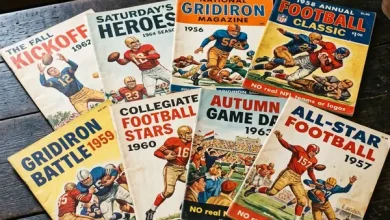
Before the internet delivered every statistic, every roster transaction, and every coaching biography to any device within seconds, fans who wanted a comprehensive overview of their team relied on an annual publication: the yearbook. These volumes — typically issued before each season — compiled the information that dedicated fans needed to follow their teams with informed attention: complete rosters with photographs, coaching staff biographies, stadium guides, schedule previews, and retrospectives on the previous season’s highs and lows.
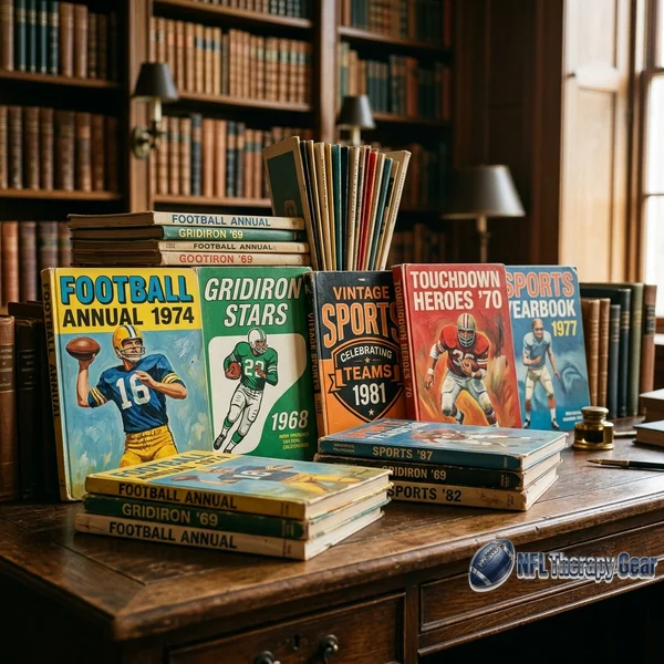
NFL team yearbooks constitute a collecting category that combines the informational density of reference material with the visual appeal of commemorative publishing. Each yearbook is a snapshot of its franchise at a specific moment — who played, who coached, what the uniforms looked like, how the stadium was configured, and what the team’s expectations were heading into a new season. Arranged chronologically on a shelf, a collection of yearbooks becomes a visual encyclopedia of franchise history that no single-volume team history book can match for detail or authenticity.
The 1950s: Origins of the Modern Yearbook
Team yearbooks in their recognizable modern form began appearing in the 1950s, though some franchises had produced roster-style publications in earlier decades. These early yearbooks were modest in scope — typically fewer than fifty pages, printed on mid-quality paper stock, and bound with saddle-stitching (stapling) rather than the perfect binding (glued spines) that would become standard for thicker later editions.
Photography in 1950s yearbooks was predominantly black-and-white, with color pages reserved for covers and occasionally for a small insert section. Player photographs tended toward formal portrait poses — head-and-shoulders shots in team jerseys, arranged in grid layouts with names and positions listed beneath each image. These grids provided the practical benefit of helping fans learn player faces and numbers before the season, functioning as visual reference guides for game-day identification.
Editorial content in early yearbooks focused on practical information. Roster listings, schedule announcements, stadium seating charts, and ticket purchasing information occupied significant page real estate. Feature articles, when present, tended toward brief player profiles or season preview essays written in the optimistic, booster-like tone that characterized sports publishing in the era. Critical analysis or candid assessment of team weaknesses was essentially absent — these were promotional publications, not journalistic ones.
The advertising content in 1950s yearbooks came primarily from local and regional businesses. Auto dealerships, breweries, department stores, and service companies purchased pages that combined team-themed messaging with commercial promotion. These advertisements provide modern collectors with fascinating windows into the commercial culture of their specific cities and decades — products, prices, and promotional language that reflect the consumer landscape of a specific place and time.
The 1960s: Growing Sophistication
The merger decade brought significant improvements to yearbook production quality. Page counts increased, photography improved, and editorial ambitions expanded beyond pure roster reference toward genuine storytelling. The growing national visibility of professional football — driven by television’s expanding reach — pushed teams to produce yearbooks that reflected the sport’s rising status as a major entertainment product.
Color photography began appearing more frequently in 1960s yearbooks, though the cost of color printing still limited its use to covers, centerfold spreads, and selected feature pages. The quality of color reproduction improved noticeably through the decade as printing technology advanced, with late-1960s yearbooks showing richer, more accurate color than their early-decade counterparts.
Action photography entered yearbooks during this period, supplementing the posed portraits that had dominated earlier publications. Readers could now see their players in game situations — throwing, catching, tackling, and celebrating — rather than only in formal studio or field-side poses. This shift reflected the broader transformation in sports photography that television’s influence accelerated, creating expectations for dynamic visual content that static portraits could not satisfy.
Team history sections became standard features during the 1960s, with yearbooks devoting pages to franchise timelines, championship histories, and profiles of retired players whose careers had already passed into historical memory. These historical sections serve modern collectors as primary sources — contemporary accounts of how teams understood and presented their own histories before subsequent decades added new layers of interpretation and revision.
The 1970s: The Golden Age
Many collectors consider the 1970s the golden age of NFL yearbook production. Page counts reached their highest levels, photography achieved consistent professional quality in both color and black-and-white reproduction, and editorial content reached depths of coverage that treated fans as knowledgeable, engaged audiences deserving substantive analysis rather than simplistic promotion.
Full-color covers featuring dramatic action photography or commissioned artwork became universal during this decade. Cover design received serious attention — teams hired graphic designers and photographers specifically for yearbook cover work, producing images that functioned as poster-quality artwork suitable for display independent of the publication they fronted.
Interior photography expanded to include behind-the-scenes content: training camp activities, locker room scenes, travel photographs, and candid moments that revealed the human dimension of professional football beyond game-day performance. These intimate images gave fans a sense of access to their teams’ daily lives that game broadcasts and newspaper coverage did not provide, making the yearbook feel like an insider’s document rather than a public relations piece.
Statistical sections grew more comprehensive, with detailed breakdowns of individual and team performance supplementing the narrative content. These statistical pages serve modern researchers as reference material, providing season-specific data in a pre-digital format that captures how teams tracked and presented performance metrics before computerized statistical systems became standard.
The production values of 1970s yearbooks reflected the economic confidence of professional football during a period of significant audience growth. Thicker paper stock, wider use of full-color pages, higher-quality binding, and more generous page counts indicated that teams were willing to invest in publications that served as both fan service and brand ambassadors.
The 1980s and 1990s: Commercial Evolution
Yearbooks from the 1980s and 1990s continued the production quality established in the previous decade while incorporating new design tools and marketing approaches. Computer-aided design began replacing manual layout processes in the late 1980s, producing cleaner typography, more precise image placement, and graphic effects — drop shadows, gradient backgrounds, digital montages — that were impossible with traditional paste-up layout methods.
The commercial dimension of yearbooks expanded during this period. National advertisers appeared alongside local businesses, and the ratio of editorial content to advertising shifted modestly toward advertising as teams recognized yearbooks as revenue-generating products rather than purely promotional items. Premium advertisers purchased full-page, full-color positions, while smaller local advertisers continued to occupy classified-style pages toward the back of each issue.
Photography in this period benefited from advances in lens technology, film speed, and color reproduction that produced sharper, more vibrant images than earlier decades had achieved. Autofocus cameras and high-speed motor drives enabled photographers to capture game action with a consistency and quality that manual-focus, hand-advance equipment could not match, and the best images from this era of yearbook photography rival the quality of sports magazine illustration.
The rise of team-specific cable television programming during the 1990s created competition for the yearbook’s role as the primary source of team-specific content. Fans who could watch team-produced programming throughout the week had less need for a printed annual publication to provide the behind-the-scenes access and season preview content that yearbooks had previously delivered exclusively. This competitive pressure began shifting the yearbook’s identity from reference tool toward commemorative keepsake.
The Modern Era: Digital Competition
Twenty-first century yearbooks exist in an information environment radically different from the one their predecessors served. Every statistic, roster update, schedule change, and coaching biography is available instantly online. The practical reference function that originally justified the yearbook’s existence has been entirely absorbed by digital platforms that deliver information more quickly, more comprehensively, and more frequently than any annual publication can manage.
Modern yearbooks have responded by emphasizing their identity as physical objects — premium keepsakes whose appeal lies in their tangibility, their design quality, and their status as collectible artifacts rather than their utility as information sources. Production values reflect this identity shift: higher paper quality, more ambitious graphic design, and premium binding approaches position modern yearbooks as display-worthy publications that compete on aesthetic merit rather than informational necessity.
Some franchises have reduced yearbook production or transitioned to digital-only formats, reflecting market conditions in which printed publications face declining demand. Other teams maintain robust yearbook programs, recognizing that the physical publication serves a collecting audience that values printed media specifically because it exists in a format increasingly displaced by digital alternatives.
Condition and Preservation
Yearbook preservation follows the principles applicable to magazine-format publications: acid-free storage materials, UV-filtered display glazing, horizontal stacking with interleaving boards, and controlled temperature and humidity environments. The specific condition factors most relevant to yearbook evaluation include cover integrity, spine condition, page completeness, and the presence or absence of ownership markings.
Cover condition dominates visual assessment because the cover is the first element visible in any display arrangement. Creasing, tearing, staining, and edge wear affect covers more than interiors because covers absorb the brunt of handling and environmental exposure. Yearbooks stored flat with protective covers or in archival sleeves maintain cover quality significantly better than those stored upright or unprotected.
Spine condition matters particularly for perfect-bound yearbooks, where adhesive failures can cause pages to loosen and fall out. Checking spine flexibility — gently fanning pages to observe whether the binding holds — identifies potential structural weaknesses before they result in page loss. Spine reinforcement using archival tape can stabilize weakened bindings, though purist collectors may prefer to accept condition limitations rather than introduce non-original materials.
Ownership markings — names, addresses, or notations written by previous owners — represent a condition factor that divides collector opinion. Some collectors view period ownership inscriptions as evidence of genuine use that adds historical character, while others prefer clean, unmarked examples. The location of markings matters: a name written inside the front cover affects visual presentation less than markings on feature pages or across photographs.
Collecting Approaches
Building a yearbook collection offers several organizational strategies, each with distinct appeal. Single-franchise runs — assembling every yearbook issued by one team across available decades — create comprehensive franchise histories that reward long-term collecting patience. Completing a run requires filling gaps year by year, with some individual years proving significantly more challenging to locate than others.
Era-specific collections gather yearbooks from multiple teams during a chosen decade, creating cross-sectional views of the league’s visual and editorial culture during specific periods. A collection of yearbooks from every team’s 1975 issue, for example, provides a panoramic view of how the entire league presented itself at a single historical moment — a snapshot impossible to assemble from any other single source.
Championship-year collections focus on yearbooks from seasons that ended in championship victories, creating a curated subset that highlights peak moments in franchise history. These selective collections maintain manageable size while focusing on the seasons most likely to generate long-term collecting interest and emotional significance.
Yearbooks Versus Media Guides
An important distinction exists between fan-oriented yearbooks and press-focused media guides, though the two categories are sometimes confused in collecting contexts. Media guides — produced for journalists, broadcasters, and credentialed media — contain more detailed statistical information, more comprehensive biographical data, and more extensive historical records than consumer yearbooks. Their purpose is functional rather than commemorative: providing working media with the reference information needed for professional coverage.
Media guides were typically not sold to the general public, which makes them inherently scarcer than consumer yearbooks produced in quantities intended for retail distribution. Some collectors specifically pursue media guides for their informational depth, while others focus on consumer yearbooks for their superior visual design and commemorative quality. Understanding the distinction helps collectors accurately identify and categorize the publications they encounter.
The physical characteristics of media guides differ from yearbooks in several recognizable ways. Media guides tend to have more text-heavy layouts, smaller photographs, thinner paper stock optimized for information density rather than visual impact, and simpler cover designs that prioritize identification over artwork. Binding styles vary — some media guides use spiral or comb binding for flat-laying reference use, while others use standard perfect binding similar to yearbooks.
Both categories have collecting merit, and some comprehensive collections include both the consumer yearbook and the media guide from each season, creating parallel documentation that captures how the same team presented itself to different audiences — the general fan public through the yearbook and the professional media through the guide — in the same historical moment.
Display and Shelf Presentation
Yearbook collections lend themselves naturally to shelf display because their uniform format creates visually coherent arrangements. A continuous run of yearbooks from a single franchise, arranged chronologically on a shelf, produces a visual timeline where spine colors, typography styles, and thickness variations communicate design evolution at a glance even before individual volumes are pulled for closer examination.
Bookends designed for sports publications hold yearbook collections upright while adding thematic decoration to the display. Football-shaped bookends, team-branded end pieces, or custom-carved supports frame the collection with contextual elements that reinforce the publication’s sporting identity. The physical weight of a complete yearbook collection — potentially spanning forty or more volumes — requires shelving with adequate load-bearing capacity, particularly for dense hardcover editions from eras when yearbook production values were at their highest.
Selected volumes can be displayed open to featured pages, highlighting particularly striking photographs, notable player profiles, or historically significant editorial content. Book stands or display easels hold publications open at chosen pages while protecting the spine from the stress of prolonged flat-open positioning. Rotating which volumes are displayed open — changing the featured yearbook periodically — keeps the display fresh and provides regular opportunities to revisit different chapters of the franchise’s documented history.
The graphic design dimension of yearbook collecting appeals to enthusiasts who appreciate printing and layout artistry alongside sporting content. Yearbook covers, in particular, function as standalone examples of commercial graphic design from their respective periods. A chronological wall display of yearbook covers — mounted and framed individually or arranged in a grid format — creates a visual survey of graphic design evolution that documents how typography, color sensibility, photography styles, and layout conventions changed across the decades of professional football history.
Vintage NFL yearbooks endure as collectibles because they combine visual appeal, informational depth, and historical specificity in a portable, displayable format. Each yearbook is simultaneously a piece of graphic design, a historical document, and a personal time capsule that connects its owner to a specific team at a specific moment. On a shelf or in a frame, these publications transform abstract franchise history into something tangible — a printed record of the seasons that built the sport’s legacy, one year at a time.
References:
- Pro Football Hall of Fame — Team Publication Archives and Historical Media
- NFL.com — Franchise History and Heritage Resources
- Library of Congress — Paper and Publication Preservation Standards
- Smithsonian National Museum of American History — Sports Publication Collections
- American Institute for Conservation — Printed Media Conservation Guidelines